
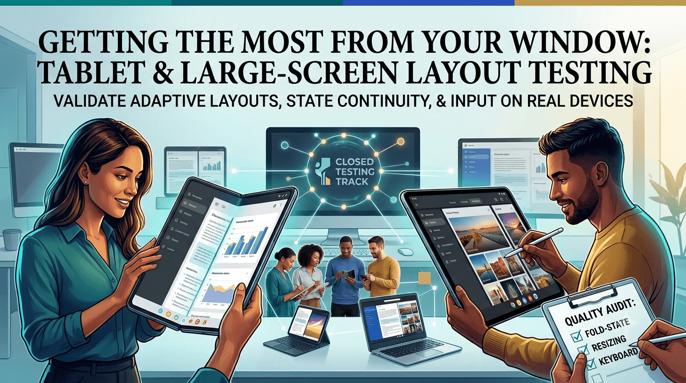
Google increasingly emphasizes large-screen devices — tablets, foldables, and Chromebooks — and both the Play Store and users judge apps on how well they use the extra space. An app that simply stretches a phone layout across a tablet looks amateurish and can be downranked for large-screen quality, while one that adapts thoughtfully reaches a growing, valuable audience. Testing your tablet and large-screen layouts is therefore worthwhile, and, like any app published from a new personal account, yours must complete a closed test with at least 12 testers opted in for 14 continuous days before production access. This guide covers tablet and large-screen layout testing to run during your window.
The closed-testing process is the same as for any app, but large-screen layouts only reveal their problems on actual large screens, so real-device testing matters. Using your window to validate tablet and foldable layouts turns the mandatory wait into a genuinely better experience for a segment Google actively promotes.
The requirement and large screens
The closed-testing requirement is tied to your developer account type, so any app on a new personal account must complete a closed test with 12+ testers for 14 continuous days before production access, regardless of form factor. See the closed testing guide. If you can recruit testers with tablets or foldables, your window becomes an opportunity to validate large-screen layouts that are otherwise hard to test.
Standard advice applies: recruit committed, device-diverse testers, keep your count above 12, and prepare your listing in parallel. For large-screen work, testers with tablets, foldables, and Chromebooks are especially valuable, since these layouts cannot be trusted on a phone alone.
Large-screen quality guidelines
Google publishes large-screen app quality guidelines describing how apps should adapt: using the available width with multi-pane layouts rather than stretched single columns, supporting both orientations, handling window resizing on foldables and Chromebooks, and providing appropriately sized touch targets and typography. Apps that meet these guidelines can be featured and ranked more favorably on large screens, while those that ignore them may be flagged as low-quality for tablets. Review Google's large screens guidance and design to it.
Use your window to check your app against these guidelines on real large screens: does it show a sensible multi-pane layout where appropriate, does it look intentional rather than a blown-up phone screen, and does content make good use of the width? Because large-screen quality now affects both discoverability and user impression, meeting these guidelines is a real competitive advantage in a growing segment. See listing optimization.
Responsive layout and window sizes
The core of large-screen support is responsive layout: your UI should adapt to the available window size rather than assuming a phone-shaped screen. Test your app across a range of window sizes and orientations, including split-screen multi-window, foldable states (folded, unfolded, and mid-fold), and Chromebook resizable windows. Content should reflow sensibly, navigation should adapt (for example, a navigation rail on wide screens instead of a bottom bar), and nothing should be cut off, stretched, or awkwardly centered in a sea of empty space.
| Large-screen scenario | What to verify |
|---|---|
| Tablet portrait/landscape | Layout adapts, uses width well |
| Foldable fold/unfold | Smooth transition, state preserved |
| Split-screen / multi-window | Usable at reduced width |
| Chromebook resize | Continuous resize handled |
| Multi-pane layout | Master-detail where appropriate |
Foldable transitions in particular must preserve state without restarting the activity awkwardly. See dark mode and theme testing.
State continuity and input
Large screens introduce state-continuity challenges that phones rarely surface: when a foldable is unfolded, the app may recreate the activity, and if you have not handled configuration changes and state saving correctly, the user loses their place, their input, or their scroll position. Test that folding, unfolding, rotating, and resizing all preserve state seamlessly. Also test input: large screens are often used with keyboards, mice, and trackpads (especially on Chromebooks), so verify keyboard navigation, shortcuts, and pointer interactions work sensibly.
These continuity and input issues are exactly the kind of thing that never appears on a developer's phone but frustrates real tablet and Chromebook users constantly. Have testers with large-screen devices fold, rotate, resize, and use external input, reporting any lost state, awkward layouts, or broken interactions. Because this behavior is entirely dependent on real large-screen hardware, testing it during your window with appropriate testers is the only reliable way to get it right. See accessibility testing.
Setting up your closed-testing track
Once your signed release build is ready, create a closed-testing track in the Play Console and upload it, add testers by email or Google Group, and share the opt-in link each tester must use before installing. Correct configuration matters because the 14-day clock counts only opted-in testers, and a misconfigured track is a common reason developers realize late that their timer never started. Install on a tablet or foldable and confirm the layout adapts before inviting your full group. See how to create a closed testing track.
Give testers clear onboarding instructions and, for those with large-screen devices, ask them to use the app in both orientations, fold and unfold, and resize windows. Every failed opt-in is a tester who does not count toward your 12, so smooth guidance maximizes active testers from day one and gives you the large-screen coverage this testing needs.
Recruiting and managing the window
You need 12+ committed, device-diverse testers for 14 continuous days, and for tablet testing, testers with large-screen devices are the key resource. Recruit a buffer above 12, keep testers engaged with clear tasks and quick responses, and direct large-screen testers to exercise orientation, folding, and resizing. Monitor your active count in the Play Console and recruit replacements early if it slips.
If finding testers with tablets, foldables, and Chromebooks is your bottleneck, a service that supplies verified real testers on varied hardware solves it quickly. You can submit your app to get started, and read where to find real testers and how to keep testers engaged.
Why real-device testing matters here
Large-screen behavior — multi-pane layouts, foldable transitions, window resizing, and external input — simply cannot be validated on a phone or a single emulator profile. The problems that hurt most are the state loss on unfold, the stretched layouts, and the broken keyboard navigation that only appear on real tablets, foldables, and Chromebooks. Only real testers using the app on these devices reveal whether your large-screen support is genuinely good or merely a stretched phone layout.
This is why the closed-testing window, built on real opt-in testers, is valuable for large-screen quality when you can recruit the right devices. Real testers exercising your app across form factors surface the layout and continuity issues that determine your large-screen ranking and reputation. The window is your structured chance to validate a growing segment before launch, and having large-screen devices in your tester group is what makes that validation possible. See device testing.
Common large-screen pitfalls
The most common large-screen pitfalls are: stretching a phone layout across a tablet with vast empty margins; losing state when a foldable unfolds; locking orientation unnecessarily; ignoring external keyboards and pointers; and touch targets or typography that look wrong at scale. Each is avoidable, and each is far cheaper to catch during your window than after tablet users leave one-star reviews or Google flags your large-screen quality.
Use the 14 days to audit against these pitfalls on real large screens: confirm your layout adapts intentionally, state survives configuration changes, both orientations work, and input methods are supported. Catching these before production is what turns large screens from a liability into a competitive advantage. See the testing checklist.
Making the 14-day window count
Because the requirement forces you to test anyway, use the window — if you can recruit large-screen devices — to make your tablet and foldable experience genuinely good. Brief those testers to exercise orientation, folding, and resizing, and treat their reports as a chance to reach an audience Google actively promotes. A well-run window turns a mandatory delay into a materially better large-screen product.
Enter production having confirmed your app adapts intentionally and preserves state across form factors, and you gain both better rankings and a happier tablet audience. The 14 days are an investment in a segment many developers neglect. See the Play Console beginner guide.
Turning tester feedback into fixes
Give large-screen testers a frictionless way to report problems and ask specific questions: did the layout use the space well, did folding or rotating lose your place, did a keyboard or mouse work, did anything look stretched or empty? Concrete questions produce the actionable reports that let you fix the layout and continuity issues most likely to hurt large-screen quality.
Then close the loop: when you ship a build addressing reported issues, tell testers what changed and ask them to reconfirm on their tablet or foldable. This validates fixes across form factors and keeps testers engaged. An app that enters production having already refined its large-screen layouts launches ready to impress the tablet and foldable audience. See fixing crashes before production.
Use internal testing before your closed test
The Play Console's internal testing track is faster than the closed track and ideal for a first pass. For large-screen work, use it to confirm your layout adapts on a tablet or foldable before your counted 14-day window begins. Catching a broken multi-pane layout or a state-loss bug on unfold privately, rather than during your closed test, protects your testers' goodwill and lets your window focus on refinement rather than obvious breakage.
A practical rhythm is to validate each release candidate on the internal track, confirm the layout on a couple of large screens, then promote it to the closed track where your large-screen testers exercise the full range of form factors and input methods. This staging discipline keeps the closed track stable and your feedback focused on genuine large-screen quality. See internal vs closed testing.
After launch: monitoring large-screen quality
Your closed test is the start of quality assurance, not the end. After launch, monitor your large-screen quality in the Play Console, which surfaces specific tablet and foldable issues, along with reviews from large-screen users. New foldables and Chromebooks appear regularly, so treat large-screen support as an ongoing commitment and improve it over time. An app that keeps investing in large screens climbs in a segment Google promotes; one that neglects it after launch cedes that audience to competitors. See post-launch monitoring.
Key takeaways
- The 12-tester, 14-day requirement applies regardless of form factor.
- Adapt layouts intentionally — multi-pane, not stretched phone screens.
- Preserve state across folding, rotating, and resizing.
- Support external input — keyboards, mice, trackpads on Chromebooks.
- Test on real tablets, foldables, and Chromebooks with the right testers.
Frequently asked questions
Do I need to support tablets for Google Play?
You must still complete closed testing regardless. Large-screen support is not strictly mandatory but improves ranking, featuring, and user impression on a growing segment.
What is large-screen quality on Google Play?
A set of guidelines for how apps should adapt to tablets, foldables, and Chromebooks; meeting them can improve discoverability and featuring.
Why does my app restart when I unfold a foldable?
The configuration change recreates the activity. Handle configuration changes and save state so the user keeps their place.
How do I test foldables without owning one?
Recruit testers with foldables and tablets through your network or a service, since these behaviors need real large-screen hardware.
Should I support keyboard and mouse?
Yes, especially for Chromebooks. Test keyboard navigation, shortcuts, and pointer interactions on large screens.
Should I use internal testing first?
Yes. Confirm your layout adapts on a large screen via the faster internal track before your counted closed-testing window begins.
Does large-screen quality affect ranking?
It can affect featuring and how your app ranks for large-screen users, so it is worth getting right.
What is a multi-pane layout?
A master-detail arrangement that shows a list and its detail side by side on wide screens, using the space better than a stretched single column.
Should I lock orientation on large screens?
Generally no. Tablets and foldables are used in both orientations, so support portrait and landscape rather than locking to one, which feels broken on large screens.
Expanded for topical authority — additional practical sections below. Original guide content above is unchanged.
Quick answer
Tablet Layout Testing for Google Play Apps matters because Google Play production access for many new personal developer accounts depends on a successful closed test: at least 12 real testers opted in for 14 continuous days, plus a policy-compliant, stable app. Use this guide to execute the steps correctly, avoid streak-breaking mistakes, and decide whether DIY recruitment or a managed closed testing service is the better path for your deadline.
Real-world scenarios: who this matters for
The guidance in this article on Tablet Layout Testing for Google Play Apps applies across many Android product types. Use these scenarios to map the advice to your situation.
| Developer type | Typical challenge | Practical focus |
|---|---|---|
| Indie / solo | Limited tester network and time | Start closed testing early; keep a buffer above 12 opted-in testers; parallelize listing + Data safety work |
| Startup | Launch deadline vs 14-day rule | Treat the window as fixed; recruit in parallel with QA; avoid last-minute track setup |
| Agency / white-label | Multiple client apps, each needing its own test | One closed test per app; standardize opt-in onboarding; track eligibility dates per client |
| Flutter / React Native | Cross-platform build + Play Console quirks | Ship a signed AAB to closed testing; verify installs from Play, not sideload; watch vitals on mid-range devices |
| Native Kotlin | Device/API fragmentation | Cover API levels and OEMs in your tester mix; fix crashes before requesting production |
| Game / Unity | Performance + retention during 14 days | Keep testers engaged so count never dips below 12; monitor ANRs and battery |
| E-commerce / fintech | Policy + payment flows | Test checkout, permissions, and declarations carefully before production access |
| Healthcare / kids / education | Sensitive policies (Families, data) | Align listing, privacy, and content rating with real app behavior during the test window |
Visual placeholder: Scenario matrix infographic — Indie / Startup / Agency / Cross-platform paths for Tablet Layout Testing for Google Play Apps.
Comparison: DIY recruitment vs managed closed testing
When your goal is Google Play production access, the path you choose for testers affects time, risk, and feedback quality. Use this comparison while deciding how to apply Tablet Layout Testing for Google Play Apps.
| Approach | Time to 12 opted-in | Cost | Dropout risk | Feedback quality | Best when |
|---|---|---|---|---|---|
| Friends & family | Days–weeks | $0 | High | Mixed | Tiny MVP, flexible timeline |
| Reddit / Discord / Telegram | Unpredictable | $0–low | High | Variable | You can manage onboarding daily |
| Peer community exchange | Variable | $0 | Medium | Developer-biased | You can test others’ apps in return |
| Managed closed testing (e.g. Fast Testers) | ~1 hour after valid link | $15 one-time / app | Low (buffer of 15) | Real Play installs | You need speed + continuity for 14 days |
Decision tip: If a broken streak would delay revenue or a client deadline, prioritize reliability over $0 recruitment. DIY is fine when you already have engaged testers and can monitor Play Console daily.
Visual placeholder: Comparison diagram — DIY vs community vs managed testing for Tablet Layout Testing for Google Play Apps.
Common mistakes (and how to avoid them)
These mistakes repeatedly show up when developers work through Tablet Layout Testing for Google Play Apps:
- Confusing invited vs opted-in testers — Only testers who open the opt-in link and install from Play count toward 12. Check the opted-in number in Play Console, not your email list.
- Recruiting exactly 12 with no buffer — One uninstall can break continuity. Aim for ~15 active opted-in testers.
- Starting the counted clock late — Listing assets, Data safety, and privacy work should run during the 14 days, not after.
- Using sideloaded APKs or fake installs — They do not satisfy Play’s closed testing expectations and can create account risk.
- Ignoring tester feedback until day 14 — Crashes that drive uninstalls threaten your streak and your review outcome.
- Requesting production access before the continuous streak completes — Eligibility checks fail even if calendar time has passed.
Troubleshooting checklist
If something feels “stuck” while applying Tablet Layout Testing for Google Play Apps, walk this list before changing strategy:
| Symptom | Likely cause | Fix |
|---|---|---|
| Console shows < 12 testers | Invites sent but not opted in | Resend opt-in link; confirm install from Play |
| “Not eligible” after 14 calendar days | Count dipped below 12 mid-window | Restore 12+ and complete a full continuous streak |
| Tester cannot join | Wrong account, Group lag, or track not published | Verify Google account, Group membership, track release |
| App fails to install | Device/API mismatch or signing issue | Check AAB, minSDK, Play App Signing |
| Production still rejected after testing | Policy, declarations, or stability — not the clock | Read the exact reason; fix that category completely |
Visual placeholder: Troubleshooting flowchart for Tablet Layout Testing for Google Play Apps.
Action checklist
Use this checklist alongside the rest of this guide on Tablet Layout Testing for Google Play Apps:
- ☐ Closed testing track created with a signed release (AAB)
- ☐ Opt-in link tested on a fresh Google account
- ☐ At least 12 testers opted in (prefer ~15)
- ☐ Daily check that opted-in count stays ≥ 12 for 14 continuous days
- ☐ Core flows exercised (login, main feature, permissions, offline/online)
- ☐ Crashes / ANRs triaged from tester reports and vitals
- ☐ Store listing, screenshots, and feature graphic drafted
- ☐ Privacy policy + Data safety + content rating aligned with real behavior
- ☐ Production access requested only after eligibility is green
- ☐ Staged rollout plan ready for first public release
Additional FAQs developers ask about Tablet Layout Testing for Google Play Apps
Quick answer: what should I do first?
Confirm you are on a closed testing track with real opted-in installs, keep 12+ testers for 14 continuous days, and fix policy/stability issues in parallel. Then use the detailed sections above for Tablet Layout Testing for Google Play Apps.
Does this apply to organization (company) accounts?
The classic 12×14 closed testing gate is primarily associated with new personal developer accounts. Always verify your account type and current Play Console eligibility messaging for your app.
Do friends and family count as testers?
Yes — if they opt in via your closed testing link and install from Google Play. They only help if they stay opted in for the continuous period.
Can I update the app during the 14 days?
You can usually push updates on the closed track, but unstable releases that cause uninstalls can threaten your tester count. Prefer polishing via internal testing first when possible.
What if production access is still rejected?
Read the exact reason. Incomplete testing is only one category — policy, Data safety mismatches, and crashes are common. Fix the cited issue fully before reapplying.
Is paying for testers allowed?
Using real people who install from Play is what matters. Avoid fake install farms. A one-time managed service that supplies real closed testers is a practical option when DIY recruitment is too slow.
How is Fast Testers different from free communities?
Free communities trade time and mutual availability. Fast Testers assigns about 15 real testers after you submit a valid closed testing link (one-time $15 per app) and includes a production access guarantee under its refund terms.
Where should I go next?
Review the related guides below, then either finish DIY recruitment or start closed testing if you need speed and continuity.
Sources, updates, and how to use this guide
This article on Tablet Layout Testing for Google Play Apps is maintained for Android developers preparing Google Play closed testing and production access. Always cross-check eligibility text inside your own Play Console, because Google’s UI labels and account rules can vary by account type and date.
- Primary official references: Google Play closed testing help, Developer Program Policies, and Play Console eligibility messaging for your app.
- Practical experience lens: guidance here reflects common failure modes indie developers and agencies hit when recruiting testers, maintaining the 14-day streak, and recovering from production-access rejections.
- Last reviewed focus: 12×14 closed testing continuity, real vs fake testers, and parallel listing/compliance work during the window.
Related guides and next steps
Continue building topical depth around Tablet Layout Testing for Google Play Apps with these Fast Testers resources:
- Ad Supported Apps And Google Play Ad Policy Testing
- Agency Guide Testing Client Apps On Google Play
- Android Tv Apps And Google Play Testing Tracks
- Closed Testing Vs Open Testing On Google Play
- Education Apps And Google Play Compliance Testing
- Finance Apps Google Play Testing And Compliance
- Fitness Apps And Google Play Beta Testing Rules
- Google Play Closed Testing For Flutter Apps
- Pricing — $15 closed testing
- How Fast Testers works
- FAQ
- Developer reviews
- Case studies
- Submit your app / start closed testing
Need reliable testers so your 14-day streak does not stall? Educate first with the guides above, then start when you are ready — one-time pricing, real Play installs, dashboard tracking.
Internal navigation hub — added to strengthen topical connections. Original article content above is unchanged.
Continue learning
- Android TV Apps and Google Play Testing Tracks — Learn about Android TV testing for Google Play closed testing. Complete guide for Android developers publishin.
- Education Apps and Google Play Compliance Testing — Learn about EdTech app testing for Google Play closed testing. Complete guide for Android developers publishin.
- Productivity Apps: Meeting Google Play Testing Rules — Learn about productivity app testing for Google Play closed testing. Complete guide for Android developers pub.
- Social Apps and Google Play Closed Testing Volume — Learn about social app testing for Google Play closed testing. Complete guide for Android developers publishin.
- E-commerce Android Apps: Play Store Testing Tips — Learn about e-commerce testing for Google Play closed testing. Complete guide for Android developers publishin.
- Google Play Pre-Launch Report vs Closed Testing — Learn about pre-launch testing for Google Play closed testing. Complete guide for Android developers publishin.
Next steps
- Ready to run closed testing with real Android testers? Submit your app or see pricing ($15 one-time).
- Compare options on our testing service comparison page, or read developer reviews and case studies.
- Still deciding? Review how Fast Testers works and the FAQ.