
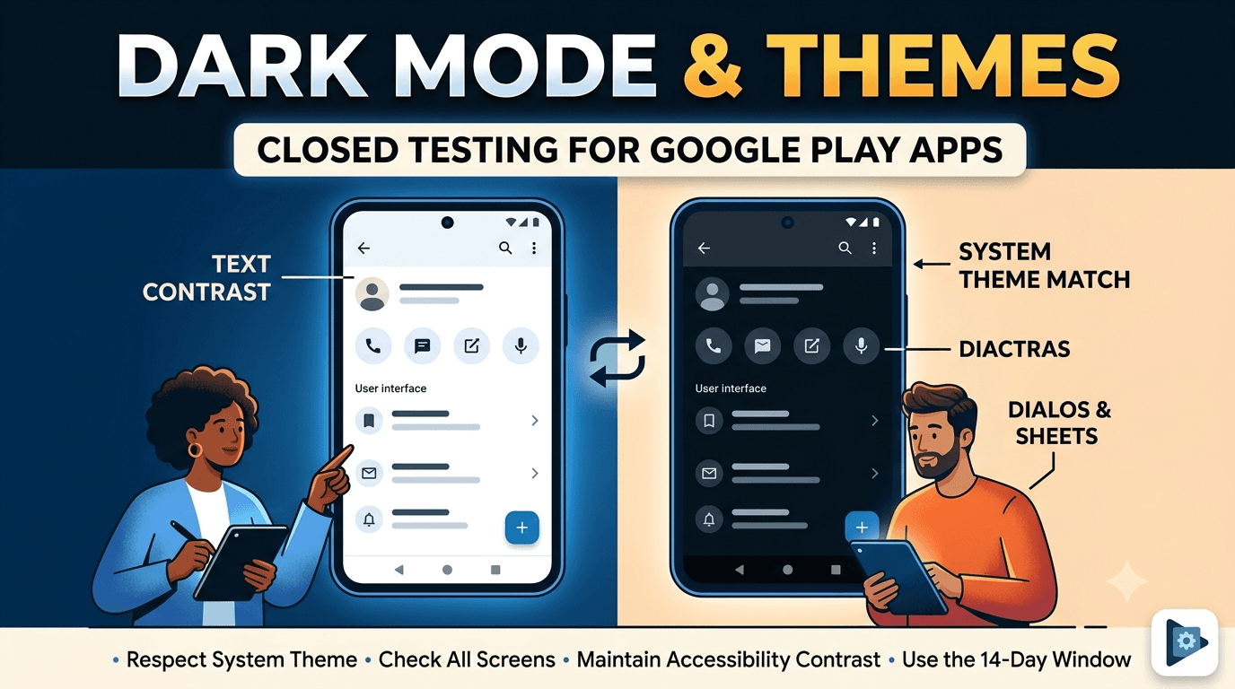
Dark mode is now an expectation rather than a nicety, and users notice immediately when an app ignores their system theme or implements dark mode poorly with unreadable text, washed-out colors, or jarring flashes of white. Supporting light and dark themes well — and handling dynamic color and theme switching gracefully — is part of feeling like a polished, modern Android app. Testing your theming thoroughly is worthwhile, and, like any app published from a new personal account, yours must complete a closed test with at least 12 testers opted in for 14 continuous days before production access. This guide covers dark mode and theme testing to run during your window.
The closed-testing process is the same as for any app, but theme problems often appear only on specific screens, states, or devices, so real-device testing across your tester group is the reliable way to find them. Using your window to validate theming turns the mandatory wait into a more polished experience across both themes.
The requirement and theming
The closed-testing requirement is tied to your developer account type, so any app on a new personal account must complete a closed test with 12+ testers for 14 continuous days before production access, regardless of theming. See the closed testing guide. The window is a natural opportunity to have testers, some of whom use dark mode by default, surface theme problems across their devices.
Standard advice applies: recruit committed, device-diverse testers, keep your count above 12, and prepare your listing in parallel. Because many users run dark mode all the time, your tester group will naturally exercise both themes if you ask them to.
Respecting the system theme
Modern Android apps should follow the system theme by default, switching between light and dark to match the user's device setting, and ideally offering an in-app override for users who want to force one theme. Test that your app correctly detects and applies the system theme on launch, that it responds when the user changes the system theme while the app is running or backgrounded, and that any in-app theme setting persists and overrides correctly. Follow Google's dark theme guidance.
A common bug is an app that reads the theme only at launch and then fails to update when the system theme changes, leaving it mismatched until restarted. Another is a theme setting that does not persist across restarts. Test these transitions explicitly, since they are exactly where theming breaks. Getting theme detection and switching right is the foundation everything else builds on. See tablet layout testing.
Checking every screen and state
Dark mode bugs hide on the screens and states you check least often. A hardcoded color that looks fine in light mode becomes invisible in dark mode; an icon with a baked-in background shows an ugly box; a dialog, bottom sheet, or system-styled component may not follow your theme. You must review every screen, dialog, menu, empty state, error state, and loading state in both themes, because any one of them can contain unreadable text or a jarring color. This is tedious but it is where theme quality is won or lost.
| Theme test focus | Common problem |
|---|---|
| Text contrast | Hardcoded dark text invisible on dark |
| Icons & images | Baked-in backgrounds show boxes |
| Dialogs & sheets | Don't follow app theme |
| Empty/error states | Rarely checked, often broken |
| Theme switch flash | White flash during transition |
Real testers hit screens and states you forget to check yourself. See UI testing before publishing.
Dynamic color and contrast
Android's dynamic color (Material You) lets apps derive their palette from the user's wallpaper on supported devices, which is a lovely touch but adds another dimension to test: your app must look good across a range of generated palettes, not just your designed colors. If you support dynamic color, test it across several wallpapers and both themes to ensure contrast and readability hold up. Even if you do not, ensure your chosen colors meet accessibility contrast ratios in both light and dark themes, since low-contrast text is both a polish and an accessibility failure.
Contrast is the thread connecting theming and accessibility: text that is hard to read in dark mode fails real users, especially those with low vision. Verify that your text and interactive elements maintain sufficient contrast in every theme and, if applicable, across dynamic palettes. Because these issues depend on real rendering across devices and settings, checking them with real testers on varied devices is far more reliable than trusting a single design mockup. See accessibility testing.
Setting up your closed-testing track
Once your signed release build is ready, create a closed-testing track in the Play Console and upload it, add testers by email or Google Group, and share the opt-in link each tester must use before installing. Correct configuration matters because the 14-day clock counts only opted-in testers, and a misconfigured track is a common reason developers realize late that their timer never started. Install on a real device and check a few screens in both themes before inviting your full group. See how to create a closed testing track.
Give testers clear onboarding instructions and ask them to use the app in both light and dark mode and to toggle the system theme while using it, reporting anything unreadable or jarring. Every failed opt-in is a tester who does not count toward your 12, so smooth guidance maximizes active testers from day one and gives you theme coverage across devices.
Recruiting and managing the window
You need 12+ committed, device-diverse testers for 14 continuous days. Recruit a buffer above 12, keep testers engaged with clear tasks and quick responses, and ask them to explore the app in both themes. Monitor your active count in the Play Console and recruit replacements early if it slips. Since many people default to dark mode, your testers will naturally surface dark-mode issues if prompted.
If assembling a device-diverse group is your bottleneck, a service that supplies verified real testers solves it quickly. You can submit your app to get started, and read where to find real testers and how to keep testers engaged.
Why real-device testing matters here
Theme rendering depends on the actual device, OS version, manufacturer skin, and settings like dynamic color, so a screen that looks perfect in your design tool or on one device can render with poor contrast or a stray white background elsewhere. The bugs cluster on the screens and states developers rarely revisit and on devices they do not own. Only real testers using the app in their preferred theme across varied devices reveal the unreadable text and jarring transitions that undermine polish.
This is why the closed-testing window, built on real opt-in testers, is useful for theming. Real testers, many of whom live in dark mode, exercise your app across screens and devices in ways that expose theme problems you would never catch alone. The window is your structured chance to polish both themes before launch, and device and preference diversity in your tester group makes that polish thorough. See device testing.
Making the 14-day window count
Because the requirement forces you to test anyway, use the window to review your app systematically in both themes. Ask testers to flag anything unreadable, boxy, or jarring, and work through every screen and state yourself in dark mode, since that is where most theme bugs hide. A well-run window turns a mandatory delay into a genuinely polished, theme-aware app that feels modern.
Enter production having confirmed every screen reads well in both themes, transitions are smooth, and contrast holds up, and you deliver the polish users now expect. The 14 days are an investment in the perceived quality of your app. See the Play Console beginner guide.
Turning tester feedback into fixes
Give testers a frictionless way to report problems and ask specific questions: was any text hard to read in dark mode, did any icon show an ugly box, did switching themes cause a flash, did any dialog stay the wrong color? Concrete questions produce the actionable reports that let you fix the specific theme issues most likely to hurt polish.
Then close the loop: when you ship a build addressing reported issues, tell testers what changed and ask them to reconfirm in both themes on their device. This validates fixes across devices and keeps testers engaged. An app that enters production having already polished both themes launches feeling modern and considered rather than half-finished. See fixing crashes before production.
Use internal testing before your closed test
The Play Console's internal testing track is faster than the closed track and ideal for a first pass. For theming, use it to sweep your main screens in both themes on a couple of devices before your counted 14-day window begins. Catching a glaring dark-mode contrast bug privately, rather than during your closed test, lets your window focus on the subtle, screen-specific issues that need broad device coverage rather than obvious breakage.
A practical rhythm is to validate each release candidate on the internal track, confirm both themes look right on a couple of real devices, then promote it to the closed track where your testers surface the edge-case screens and states. This staging discipline keeps the closed track stable and your feedback focused on genuine polish. See internal vs closed testing.
After launch: keeping themes polished
Your closed test is the start of quality assurance, not the end. After launch, keep an eye on reviews mentioning readability or dark-mode problems, and re-check theming whenever you add new screens or change colors, since a single hardcoded color can reintroduce a dark-mode bug. New devices and OS versions can also alter dynamic-color behavior. An app that keeps both themes polished as it evolves maintains its modern feel; one that lets dark mode rot with each new feature erodes it. See post-launch monitoring.
Key takeaways
- The 12-tester, 14-day requirement applies regardless of theming.
- Follow the system theme and update when it changes at runtime.
- Check every screen and state in both themes — bugs hide in rarely-seen states.
- Maintain contrast for readability and accessibility in both themes.
- Test dynamic color across wallpapers if you support Material You.
Frequently asked questions
Do I have to support dark mode?
It is not strictly mandatory, but users expect it, and ignoring the system theme makes an app feel dated. It is strongly recommended.
Why doesn't my app update when the system theme changes?
Likely because it reads the theme only at launch. Handle theme configuration changes so the UI updates at runtime.
Where do dark-mode bugs usually hide?
On rarely-checked screens and states — dialogs, empty states, error states — and in hardcoded colors and icons with baked-in backgrounds.
What is dynamic color?
Material You lets apps derive their palette from the user's wallpaper on supported devices. Test across several wallpapers if you support it.
How does theming relate to accessibility?
Low-contrast text fails both polish and accessibility. Ensure sufficient contrast in every theme, especially for users with low vision.
Should I use internal testing first?
Yes. Sweep your main screens in both themes on the faster internal track before your counted closed-testing window begins.
Why does a white flash appear when switching themes?
Usually because the window background is not themed or the transition recreates views without a matching background. Set a theme-aware window background to avoid it.
Should I offer an in-app theme override?
It is a nice touch. Follow the system theme by default and let users force light or dark, ensuring the choice persists across restarts.
How do I check contrast quickly?
Use the Accessibility Scanner or a contrast checker against your text and background colors in both themes to confirm they meet recommended ratios.
Why do icons show an ugly box in dark mode?
Because the icon has a baked-in background color instead of transparency. Use transparent or theme-aware assets so icons blend into either theme.
Do system dialogs follow my app theme?
Not always automatically. Style dialogs, bottom sheets, and menus with your theme and test them in dark mode, since they are a frequent source of mismatched surfaces.
Expanded for topical authority — additional practical sections below. Original guide content above is unchanged.
Quick answer
Dark Mode and Theme Testing on Android matters because Google Play production access for many new personal developer accounts depends on a successful closed test: at least 12 real testers opted in for 14 continuous days, plus a policy-compliant, stable app. Use this guide to execute the steps correctly, avoid streak-breaking mistakes, and decide whether DIY recruitment or a managed closed testing service is the better path for your deadline.
Real-world scenarios: who this matters for
The guidance in this article on Dark Mode and Theme Testing on Android applies across many Android product types. Use these scenarios to map the advice to your situation.
| Developer type | Typical challenge | Practical focus |
|---|---|---|
| Indie / solo | Limited tester network and time | Start closed testing early; keep a buffer above 12 opted-in testers; parallelize listing + Data safety work |
| Startup | Launch deadline vs 14-day rule | Treat the window as fixed; recruit in parallel with QA; avoid last-minute track setup |
| Agency / white-label | Multiple client apps, each needing its own test | One closed test per app; standardize opt-in onboarding; track eligibility dates per client |
| Flutter / React Native | Cross-platform build + Play Console quirks | Ship a signed AAB to closed testing; verify installs from Play, not sideload; watch vitals on mid-range devices |
| Native Kotlin | Device/API fragmentation | Cover API levels and OEMs in your tester mix; fix crashes before requesting production |
| Game / Unity | Performance + retention during 14 days | Keep testers engaged so count never dips below 12; monitor ANRs and battery |
| E-commerce / fintech | Policy + payment flows | Test checkout, permissions, and declarations carefully before production access |
| Healthcare / kids / education | Sensitive policies (Families, data) | Align listing, privacy, and content rating with real app behavior during the test window |
Visual placeholder: Scenario matrix infographic — Indie / Startup / Agency / Cross-platform paths for Dark Mode and Theme Testing on Android.
Closed testing vs other Play tracks (quick reference)
Context for Dark Mode and Theme Testing on Android: choose the right track so you do not waste the 14-day window on the wrong workflow.
| Track | Purpose | Counts toward 12×14? | Typical use |
|---|---|---|---|
| Internal testing | Fast private builds | No | Shake out bugs before the counted window |
| Closed testing | Private / invite testers | Yes (for new personal accounts) | Meet production-access requirement + QA |
| Open testing | Public beta | Not a substitute for the closed requirement | Broader feedback after closed eligibility |
| Production | Public release | N/A | After access approved + review |
Visual placeholder: Timeline — Internal → Closed (14 days) → Production request → Staged rollout.
Common mistakes (and how to avoid them)
These mistakes repeatedly show up when developers work through Dark Mode and Theme Testing on Android:
- Confusing invited vs opted-in testers — Only testers who open the opt-in link and install from Play count toward 12. Check the opted-in number in Play Console, not your email list.
- Recruiting exactly 12 with no buffer — One uninstall can break continuity. Aim for ~15 active opted-in testers.
- Starting the counted clock late — Listing assets, Data safety, and privacy work should run during the 14 days, not after.
- Using sideloaded APKs or fake installs — They do not satisfy Play’s closed testing expectations and can create account risk.
- Ignoring tester feedback until day 14 — Crashes that drive uninstalls threaten your streak and your review outcome.
- Requesting production access before the continuous streak completes — Eligibility checks fail even if calendar time has passed.
Troubleshooting checklist
If something feels “stuck” while applying Dark Mode and Theme Testing on Android, walk this list before changing strategy:
| Symptom | Likely cause | Fix |
|---|---|---|
| Console shows < 12 testers | Invites sent but not opted in | Resend opt-in link; confirm install from Play |
| “Not eligible” after 14 calendar days | Count dipped below 12 mid-window | Restore 12+ and complete a full continuous streak |
| Tester cannot join | Wrong account, Group lag, or track not published | Verify Google account, Group membership, track release |
| App fails to install | Device/API mismatch or signing issue | Check AAB, minSDK, Play App Signing |
| Production still rejected after testing | Policy, declarations, or stability — not the clock | Read the exact reason; fix that category completely |
Visual placeholder: Troubleshooting flowchart for Dark Mode and Theme Testing on Android.
Action checklist
Use this checklist alongside the rest of this guide on Dark Mode and Theme Testing on Android:
- ☐ Closed testing track created with a signed release (AAB)
- ☐ Opt-in link tested on a fresh Google account
- ☐ At least 12 testers opted in (prefer ~15)
- ☐ Daily check that opted-in count stays ≥ 12 for 14 continuous days
- ☐ Core flows exercised (login, main feature, permissions, offline/online)
- ☐ Crashes / ANRs triaged from tester reports and vitals
- ☐ Store listing, screenshots, and feature graphic drafted
- ☐ Privacy policy + Data safety + content rating aligned with real behavior
- ☐ Production access requested only after eligibility is green
- ☐ Staged rollout plan ready for first public release
Additional FAQs developers ask about Dark Mode and Theme Testing on Android
Quick answer: what should I do first?
Confirm you are on a closed testing track with real opted-in installs, keep 12+ testers for 14 continuous days, and fix policy/stability issues in parallel. Then use the detailed sections above for Dark Mode and Theme Testing on Android.
Does this apply to organization (company) accounts?
The classic 12×14 closed testing gate is primarily associated with new personal developer accounts. Always verify your account type and current Play Console eligibility messaging for your app.
Do friends and family count as testers?
Yes — if they opt in via your closed testing link and install from Google Play. They only help if they stay opted in for the continuous period.
Can I update the app during the 14 days?
You can usually push updates on the closed track, but unstable releases that cause uninstalls can threaten your tester count. Prefer polishing via internal testing first when possible.
What if production access is still rejected?
Read the exact reason. Incomplete testing is only one category — policy, Data safety mismatches, and crashes are common. Fix the cited issue fully before reapplying.
Is paying for testers allowed?
Using real people who install from Play is what matters. Avoid fake install farms. A one-time managed service that supplies real closed testers is a practical option when DIY recruitment is too slow.
How is Fast Testers different from free communities?
Free communities trade time and mutual availability. Fast Testers assigns about 15 real testers after you submit a valid closed testing link (one-time $15 per app) and includes a production access guarantee under its refund terms.
Where should I go next?
Review the related guides below, then either finish DIY recruitment or start closed testing if you need speed and continuity.
Sources, updates, and how to use this guide
This article on Dark Mode and Theme Testing on Android is maintained for Android developers preparing Google Play closed testing and production access. Always cross-check eligibility text inside your own Play Console, because Google’s UI labels and account rules can vary by account type and date.
- Primary official references: Google Play closed testing help, Developer Program Policies, and Play Console eligibility messaging for your app.
- Practical experience lens: guidance here reflects common failure modes indie developers and agencies hit when recruiting testers, maintaining the 14-day streak, and recovering from production-access rejections.
- Last reviewed focus: 12×14 closed testing continuity, real vs fake testers, and parallel listing/compliance work during the window.
Related guides and next steps
Continue building topical depth around Dark Mode and Theme Testing on Android with these Fast Testers resources:
- Analytics Sdk Testing During Closed Testing
- Android Beta Testing Best Practices
- Android Tv Apps And Google Play Testing Tracks
- Ar Vr Android Apps And Closed Testing Requirements
- Closed Testing Vs Open Testing On Google Play
- E Commerce Android Apps Play Store Testing Tips
- Functional Testing For Android Apps
- Google Play Android Vitals During Closed Testing
- Pricing — $15 closed testing
- How Fast Testers works
- FAQ
- Developer reviews
- Case studies
- Submit your app / start closed testing
Need reliable testers so your 14-day streak does not stall? Educate first with the guides above, then start when you are ready — one-time pricing, real Play installs, dashboard tracking.
Further expansion — case study, decisions, and expert recommendations. Prior sections remain unchanged.
Case study: first Play launch planned around the closed testing window
Problem: A small SaaS team treated Google Play publishing like iOS TestFlight — they expected to upload and go public the same week. They discovered the personal-account closed testing gate mid-sprint.
Solution: They reframed the sprint around Dark Mode And Theme Testing On Android: internal testing for crash triage first, then closed testing with a buffer of testers, while design finished screenshots and legal finished privacy/Data safety in parallel.
Result: The 14-day requirement stopped feeling like “dead time.” When eligibility flipped green, listing and declarations were already ready, so production review was the only remaining gate.
Lessons learned:
- Start the closed track as soon as the build is stable enough to keep installed.
- Parallelize compliance work inside the window.
- Protect the streak like a production SLA.
Decision guide: what should you do next?
Use this decision path when applying Dark Mode And Theme Testing On Android:
- Is your account a new personal developer account that still needs production access?
If yes, plan for closed testing with 12+ opted-in testers for 14 continuous days. If no, still test — but confirm the exact eligibility text in Play Console. - Do you already have 12+ reliable people who will install from Play and stay for two weeks?
If yes, DIY can work — add a buffer and monitor daily. If no, use community exchange or a managed closed testing service. - Is your build stable enough that testers will not churn?
If no, run internal testing first. Entering the counted window with crash loops is how streaks die. - Are Data safety, privacy policy, permissions, and listing aligned with real behavior?
If no, fix during the window so production review does not bounce you after the clock. - Has production access been rejected?
Classify: eligibility vs policy vs declarations vs stability. Fix that category completely, then re-test / re-request.
Visual placeholder: Decision tree diagram for Dark Mode And Theme Testing On Android (DIY vs managed vs fix-and-retry).
Expert recommendations
- Instrument the streak: Check opted-in count daily for the first week; replace dropouts same day.
- Brief testers once: Send a short checklist (install from Play, open app daily, try core flow, report crashes). Silent testers still count if opted in — engaged testers protect quality.
- Never “solve” recruitment with fake installs: It fails the intent of closed testing and can create account risk.
- Ship a boring-stable build to closed testing: Save experimental features for internal tracks.
- Educate first, then accelerate: If your blocker is simply finding real testers fast, a one-time managed option (Fast Testers: 15 testers, $15/app) is often cheaper than slipping a launch.
For hands-on setup after reading about Dark Mode And Theme Testing On Android, see how it works and pricing, or submit your closed testing link when you are ready.
Internal navigation hub — added to strengthen topical connections. Original article content above is unchanged.
Continue learning
- Analytics SDK Testing During Closed Testing — Learn about analytics integration QA for Google Play closed testing. Complete guide for Android developers pub.
- OAuth Login Testing for Android Apps — Learn about authentication testing for Google Play closed testing. Complete guide for Android developers publi.
- App Bundle vs APK for Closed Testing Releases — Learn about AAB release format for Google Play closed testing. Complete guide for Android developers publishin.
- Deep Link Testing Before Google Play Production — Learn about deep link QA for Google Play closed testing. Complete guide for Android developers publishing on t.
- Instant Apps and Google Play Testing Considerations — Learn about instant app testing for Google Play closed testing. Complete guide for Android developers publishi.
- Notification Permission Changes and App Testing — Learn about notification permission testing for Google Play closed testing. Complete guide for Android develop.
Next steps
- Ready to run closed testing with real Android testers? Submit your app or see pricing ($15 one-time).
- Compare options on our testing service comparison page, or read developer reviews and case studies.
- Still deciding? Review how Fast Testers works and the FAQ.